How Do you make the most out of AirBnb?
24 Aug 2022
Analyzing AirBnb’s Seattle data from the perspective of a visitor and AirBnb marketing
Introduction
AirBnb has been an alternative to the traditional hospitality business for a while now. It has started on a very low level, the “air” in AirBnb represents an inflatable mattress that the initial users wanted to rent out in order to make an additional buck.
Nowadays AirBnb offers a wide range of homes in cities across the planet including luxury homes at a high price. It has become quite a challenge to find really good deals, especially since so many people use the service.
Seattle is a quite expensive city, and, of course, AirBnb provides homes here as well. Being a thrifty person, wouldn’t it be great to get access to AirBnb’s internal data, analysze the data, and learn about the most affordable times to visit the city and find a moderately priced neighborhood?
Also, for so many people using AirBnb as a service, it would make sense for AirBnb to utilize the power users, i.e. users who frequently stay in Seattle and write reviews. If there is significant output, these users could be turned into some kind of brand ambassadors and contribute to AirBnb’s success. Always looking for a good deal, I would be happy to become a brand ambassador myself.
Available data
I had access to three data sets:
- Listings: This is the master data showing most of the attributes. Major attributes include the location, some policy data, the home description, etc. In total there are 92 attributes for 3818 homes.
- Calendar: This basically shows the availability of a listing and the price per night. There are in total 1393570 entries with 3818 listings for every day of the year.
- Reviews: A guest is supposed to leave a review for a specific listing a t a specific date. The data set contains 84849 reviews for the Seattle area.
Interesting Business Questions
- How do the prices differ during the course of the year? Are there any trends? Are there short term deviations? → Answering this question might help when planning a trip in advance to arrive at an affordable time in the city.
- Are the there significant price differences between Seattle’s neigborhoods? → Answering this question might help when investing in property or advertising certain areas for customers who are price sensitive. Or, again, as the thrifty customer, finding an area that is affordable.
- Are there reviewers / travellers who are significantly more active that the average one? → Adressing such reviewers directly and turning them into brand ambassadors might be a cost effective marketing tool.
Part I - Price development throughout the year
The calendar data set shows the listings (identified by listing id), the date, the availability, and the price per day for each listing. It spans over a year 2016-01-04 until 2017-01-02 and shows the availability per listing during that year.
Do the prices fluctuate? Let us check a sample listing from the data set.
Taking a random id shows a contant price whenever the listing is available.
	listing_id	date	available	price
0	241032	2016-01-04	t	$85.00
1	241032	2016-01-05	t	$85.00
2	241032	2016-01-06	f	NaN
3	241032	2016-01-07	f	NaN
4	241032	2016-01-08	f	NaN
Still there is hope that there is some fluctuation, so let us analyze the complete set of data. In case there wasn’t any fluctuation, the average price per day (considering all listings) would remain stable.
After taking the days’ avaerage price values after performing some data cleansing, I get the following graph:
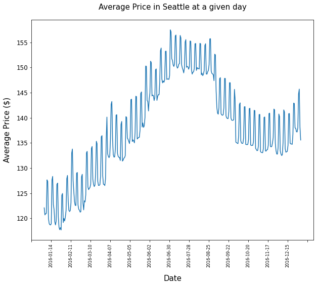
Takeaways from this images:
There seems to be great deviations within short periods of time, within weeks. To see trends over larger period of time, the data must be smoothed.
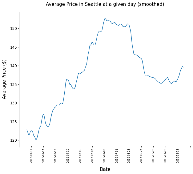
This is done - similar to the well known Covid infection numbers - by applying a rolling average of 7 days for each day - meaning that every entry represents the mean value of the day itself, the preceeding three days and the following three days.
The corresponding graph displays a much smoother line that shows some clear trends:
Conclusions
- Generally prices do deviate throughout the year.
- Prices start to increase in spring and reach climax in the summer months. They will drop in the fall and will increase at the end of the year.
- The general level of AirBnb home prices in Seattle seem to have become higher during 2016
Part II - Most sought after neighborhoods
When looking for a rather heap neighborhood, the listings dataset -containing the neighborhood of each listing- needs to be combined with the price information from the Calendar data set.
There are the following neighborhoods available:
df_listings['neighbourhood_group_cleansed'].value_counts()

Other neighborhoods    794
Capitol Hill           567
Downtown               530
Central Area           369
Queen Anne             295
Ballard                230
West Seattle           203
Rainier Valley         159
University District    122
Beacon Hill            118
Cascade                 89
Northgate               80
Delridge                79
Lake City               67
Magnolia                61
Seward Park             44
Interbay                11
So, which one will be most affordable?
The resulting data looks like this:
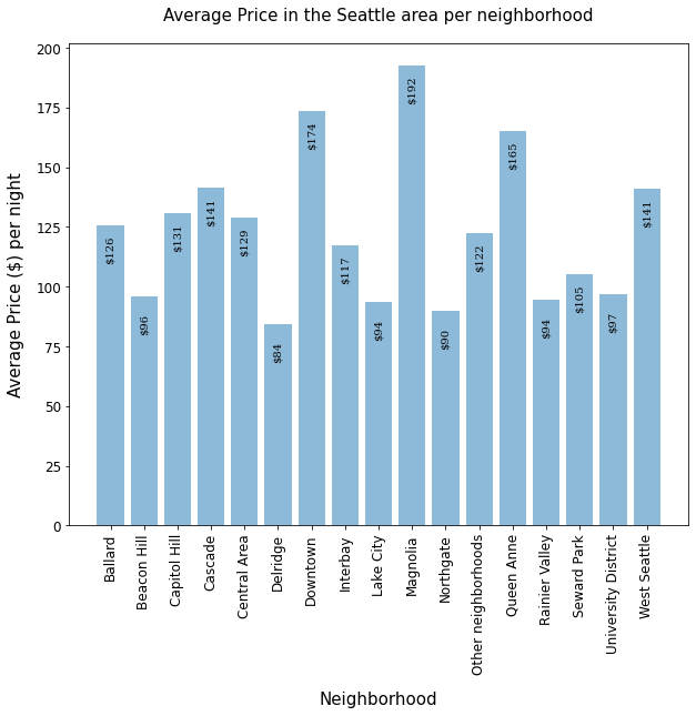
Major takeaways are:
- Prices vary quite a bit between neighborhoods in the Seattle area.
- While in Delridge the average listing is $84, for a night in Magnolia $192 on average have to be paid - more than twice on average!
Part III - Reviews, How active are the users
Finally I want to learn about the most active reviewers. Is there a significant amount of guests who keep returning to the Seattle area many times a year? These guests could be interesting for marketing activities as they might have a positive impact on prospective AirBnb customers with positive reviews. As I thrifty traveller I would also be interested to enjoy some benefits.
In order to come to a result I have to investigate the reviews data set. I group the reviews by reviewer and count the number of reviews. The result will once again be grouped such that there is…
…a group of people who wrote one review …a group of people who wrote two reviews etc
review_count number_of_reviewers
1	69381
2	4933
3	877
4	269
5	110
6	66
7	36
8	13
9	14
10	5
11	8
12	5
13	3
14	3
16	1
17	1
18	1
19	2
32	1
67	1
There is even a reviewer who wrote 67 reviews in one year!
The following graph shows the different ureviewers and their review-frequency (that directly corresponds with their travel pattern) quite nicely.
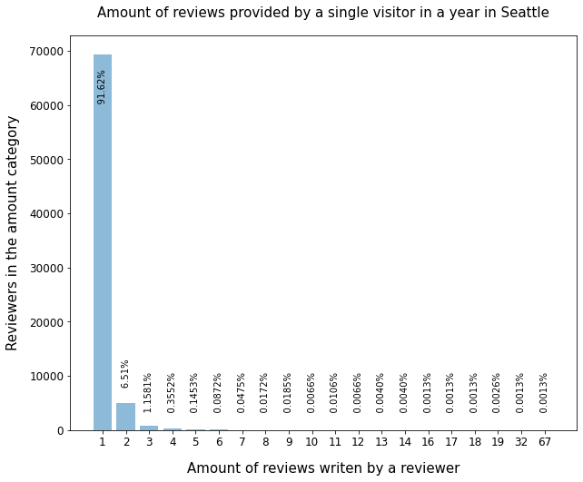
The overwhelming amount of visitors write only one review in a year (91,62%) with the number for two or three reviews per year being low already (6.51% and 1.15%). Only very few people write a high amount of reviews (in total less than 1%).
Targetting these users with specific marketing measures doesn’t seem to make much sense unfortunatley.
Conclusion and what can you do next?
If I want to spend as little as possible visiting Seattle by booking an AirBnb home I should visit early in the year and look for a home in Delridge. Unfortunately it doesn’t make much sense to set up a brand ambassador program as there are only few candidates. But being aware of that has value in itself, right?
The amount of possibilities for analyzing the data are nearly endless. Going from here how would you refine the analysis?
Maybe it makes sense to
- compare similar listings (similar size etc.) in different neighborhoods, not just the general average.
- have a closer look at deviations within a shorter timeframe.
What do you think?